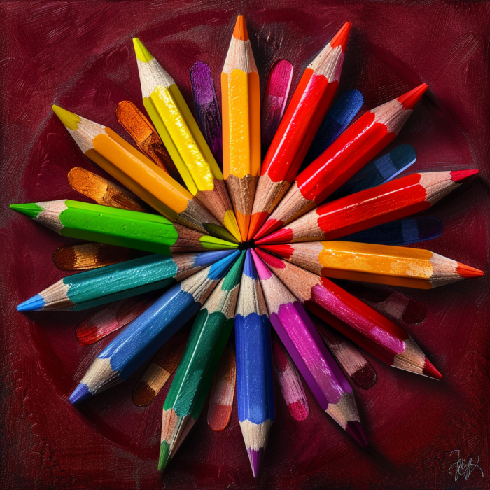
Color is more than just a visual experience; it’s a powerful tool that can influence emotions, behaviors, and decisions. In the realm of web design services, understanding the psychology of color is essential for creating websites that not only attract users but also guide them toward desired actions.
Let’s learn more about how different colors and emotions come together to affect user behavior. We’ll show you some of our web design tips that can help you incorporate color effectively into your web designs.
The Science of Color Perception

Colors and emotions are deeply rooted in human biology and psychology. The human eye can perceive millions of colors, each evoking completely different emotional responses. This capability is linked to both our evolutionary past and cultural experiences. Our ancestors relied on color to survive, using it to identify ripe fruits, navigate landscapes, and detect danger. These primal associations still influence how we respond to color today. Additionally, colors carry different meanings in various cultures. For example, while white symbolizes purity and peace in Western cultures, it also represents mourning and death in some Eastern cultures. Understanding these factors can help guide you when choosing web design services.
The Emotional Impact of Colors
Each color can evoke a specific emotional response, making it crucial to choose colors that align with your startup brand’s message and goals. Red, for instance, conveys energy, urgency, and excitement, making it perfect for call-to-action buttons, sale banners, and notifications. Blue, on the other hand, symbolizes trust, calmness, and professionalism, which is why it’s widely used in corporate websites, finance, and healthcare industries. Green represents growth, harmony, and freshness, ideal for environmental organizations, wellness, and outdoor products. Yellow signifies optimism, creativity, and warmth, making it suitable for entertainment, children’s products, and innovative tech. Purple evokes luxury, creativity, and wisdom, often used by high-end products, beauty brands, and educational content. Black exudes sophistication, elegance, and power, commonly found in luxury brands, fashion, and professional services. White stands for simplicity, purity, and cleanliness, perfect for minimalist designs, healthcare, and tech products.
By strategically incorporating colors and emotions, web designers can influence user behaviors, creating more engaging and effective websites.
Real-World Examples: Successful Use of Color in Web Design
To understand the real-world application of color psychology, let’s examine a few successful case studies. Coca-Cola’s use of red is synonymous with excitement and energy, aligning perfectly with their brand image. The red background and white text create a striking contrast, drawing immediate attention to their messages and products. Facebook, on the other hand, uses blue to foster a sense of reliability and security among users, qualities vital for a social network platform. Spotify’s green accents reflect their focus on continuous improvement and a harmonious user experience, guiding users to important features like the play button and playlist options.
These examples illustrate how thoughtful choices with colors and emotions can enhance user experience and reinforce brand identity.
Color and Conversion Rates

Did you know the right color choices can also significantly impact conversion rates? For instance, ensuring that call-to-action buttons stand out from the background can draw users’ attention and prompt clicks. A red button on a white background, for example, can create a sense of urgency. It’s also important to use colors that evoke the desired emotional response. A green call-to-action button can promote feelings of growth and positivity, encouraging users to proceed with their actions. Consistency in navigation elements prevents user confusion, while highlighting active or hovered items with distinct colors guides users intuitively through the website. On product pages, incorporating trust-building colors like blue, especially where users need to make purchases or provide personal information, can enhance trust. Warm colors like red or orange can create urgency cues for limited-time offers or stock alerts, prompting quicker user actions.
By applying the psychology of color and emotions and these strategies, web design services can optimize user interactions and boost conversion rates effectively.
A/B Testing for Optimal Color Choices
A/B testing is a powerful method to determine which colors and emotions work best for your website. Start by formulating a hypothesis on how changing a specific color element might impact user behavior. Create two versions of your webpage, each with a different color for the element being tested, and split your traffic evenly between them. Compare the performance of each version by looking at metrics such as click-through rates, conversion rates, and user engagement. Use the insights gained to make informed decisions about color usage in your web design. Regular A/B testing can help refine your color strategy and enhance overall website performance.
Accessibility Considerations

Color choice isn’t just about aesthetics and psychology; it’s also a crucial aspect of web accessibility. To ensure your website is accessible to all users, maintain sufficient contrast between text and background colors for readability. Avoid relying solely on color to convey information and use additional cues such as text labels, patterns, or shapes.
Web design services utilize tools like color contrast checkers and simulators to assess and improve the accessibility of color choices. Prioritizing accessibility can help create a more inclusive and user-friendly website.
The psychology of color and emotions is a powerful aspect of web design services that can significantly influence user behavior. By understanding the emotional and psychological impacts of different colors, you can create more engaging, effective, and inclusive websites. Whether you’re designing a corporate site, an e-commerce platform, or a personal blog, thoughtful color choices can help you achieve your goals and enhance the user experience.
Ready to transform your website with the power of web design services? Contact High Caliber Digital Marketing Solutions and The Startup Strategy today to get started on a web design that captivates and converts.


